My workshop on faceted Navigation Design in Cologne at the IA Konferenz 2010 was a success, from my perspective. It really got me thinking about the details of design solutions and ways to structure discussion around very specific aspects of faceted navigation. I’m also now on the look-out for different examples and techniques. This post is about how to handle the display of values, in particular how to show additional values.
PROBLEM
Often, there’s not enough space in the UI to show all values of faceted filters in a results list by default.
SOLUTION
Show a subset of values by default (e.g., the first 5 values), and then provide a mechanism to reach more values.
In terms of that mechanism to get to the additional values, different situations will call for different solutions. It depends on several factors, including the number of additional values, the length of value labels, and the position of facets on the page (e.g., vertical or horizontal).
Below is a collection of examples for 6 different ways to reveal more values in a faceted navigation scheme.
1. INLINE EXPAND
This is perhaps one of the most commonly-seen solutions, for instance on many e-commerce sites. It works well for many situations where there are a limited number of values. But it doesn’t necessarily scale up well. If you have more than several dozen values (or more), it may create a very long page. Figure 1, below, is from http://www.homedepot.com.
Figure 1: Example of Inline Expand from Home Depot (click to enlarge)
2. SCROLLING
Allowing users to scroll each facet component is also a common approach, and it works well in many situation. It may add an impression of more complexity to the page, and having a row of HTML scroll bars may not meet expectations of design aesthetics. Scrolling in a small range is also not a satisfying experience and can feel somewhat cramped, particularly for longer values with wrapping.
Below is an example from Zappos.com. Note that the Inline Expand approach (above) wouldn’t work well here since the facets are arranged horizontally on the page: the results would get pushed potentially far down the page.
Figure 2: Example of scrolling from Zappos.com (click to enlarge)
3. NEW PAGE
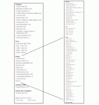
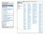
The FLAMENCO model for faceted navigation makes use of new pages to show all values from a given facet. This works well for a large number of values and for values with very long labels. In terms of overall workflow, however, this is the most intrusive of the approaches described here, and it brings the user furthest away from the results list.
Below is an example from the ACM Digital Library for the facet “Publication Title.” There are potentially a hundred values that could appear here, and some of them wrap across 5 lines. (Inline Expand wouldn’t work here at all). Note also that in the ACM example users can also select multiple values via checkboxes on the new page; whereas multiple selections weren’t possible from the default faceted navigation values.
Figure 3: Example of showing more values on a new page from ACM Digital Library (click to enlarge)
4. DYNAMIC MENU
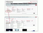
Clicking a link labeled “more” could also reveal an in-page menu with the additional values. Artist Rising has an example of this. This overcomes real estate problems elegantly and could potentially scale up, if needed. It may not be clear to users, however, that the dynamic menu represents an extension of the list since there is a physical disjunctness to the layout (in this case, at least).
Figure 4: Example of a Dynamic Menu to show more values on Artist Rising (click to enlarge)
5. PAGING
It’s rare to find an example of paging within a set of a faceted filters. Semedico uses this technique, and the interaction is fairly smooth without a page reload–just the values in the facet component update when paging. It’s easy to overlook the paging mechanism, however, so I’m not sure many people will actually find and use this feature.
Figure 5: Example of paging on Semedico (click to enlarge)
6. AUTO COMPLETE
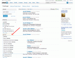
This approach is gaining in popularity, but there are still not that many examples out there. LinkedIn recently introduced faceted navigation for its person search. Some of the facets (depending on facet type) include an input field. Typing in the field presents a list of matching values from that facet via auto complete. It’s a nifty solution, but perhaps too advanced for some users to leverage effectively.
Figure 6: example of Auto Complete on LindedIn (click to enlarge)
COMBINATIONS
Of course, you’ll also find combinations of the above. For instance, in the Semedico example (Figure 5), there is also an input field to filter the list via Auto Complete. But unlike LinkedIn, this solution filters the entire list using the space of the original values (i.e., there isn’t an additional layer for the auto complete).
Another combination of solutions I’m particularly fond of is from the Freebase Parallax interface. The default state of each facet shows the top seven values with a link to view more. It feels like it should behave like an Inline Expand, but clicking the “more choices” link turns the default list into a scrolling region without a page reload. All of the additional values can be viewed by scrolling.
Figure 7: Example of a combination of techniques with Freebase Parallax (click to enlarge)
Overall, there is a range of approaches to showing more values from a facet, each with its advantages and disadvantages. One thing is for sure: you must first understand the nature of the facets themselves and, in particular, of the values. Very long lists of values may require a new page or dynamic menu. Other facets, like rating on a five-point scale, may be much more predictable and compact: you may not even need to reveal more.
As the designer, you’ll have to be aware of the benefits of each approach in order to decide which to use.


That’s an interesting compilation!
I usually see a ‘top-5’ or ‘top-8’ selection based on the number of items within the facet, sorted by alphabet or number, and then some sort of a ‘more…’ button.
I compiled a list of some Swiss examples. Mostly websites that I built in my former life…
http://e-byz.ch/usability/guided-navigation-faceted-search-websites
This coming weekend we will launch the new Guided Navigation with ALPHA.CH
Thanks for the list of Swiss. I had seen your site before–good examples.
Hi James,
thanks for the good article, it is a nie addition to your workshop. It was very comprehensive and valuable for my zurrend project.
Pingback: User Experience, Usability and Design links for May 26th | BlobFisk.com
Pingback: Guided Navigation & Faceted Search - Schweizer Beispiele | E-Business Blog von Walter Schärer
Pingback: Faceted Navigation: Showing More Values part 2 « Experiencing Information
Pingback: Faceted Navigation – Wie geht man mit vielen Facetten um | caroco.de
Pingback: Faceted Navigation: Layout and Display of Facets « Experiencing Information
Pingback: Designing Faceted Search: Getting the basics right (part 3) « Information Interaction
Pingback: Websites mit Guided Navigation / Faceted Search | eBusiness Blog von Walter Schärer
Pingback: Resources on Faceted Navigation Design | Experiencing Information