
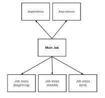
What is Jobs To Be Done?
Understanding JTBD to Avoid Common Pitfalls Every day, you have dozens of goals that you strive to accomplish. You drink coffee to get energy in the morning. Then you might drive to a park-and-ride to take the train while you commute to
What is Jobs To Be Done?
Understanding JTBD to Avoid Common Pitfalls Every day, you have dozens of goals that you strive to accomplish. You drink coffee to get energy in the morning. Then you might drive to a park-and-ride to take the train while you commute to

Second Edition of Mapping Experiences available Dec 2020
Four years after releasing Mapping Experiences, I took all the great feedback and questions I got from readers and updated the book. The 2nd Edition of Mapping Experiences is available in December 2020. Updates include: 40+ new diagrams and images

Towards Human-Centered Business
Thoughts on a more humanistic mindset across the organization In 1997, Steve Jobs returned to Apple after having been previously asked to leave the company he founded. In a town hall meeting to kick off the start of his tenure
Towards Human-Centered Business
Thoughts on a more humanistic mindset across the organization In 1997, Steve Jobs returned to Apple after having been previously asked to leave the company he founded. In a town hall meeting to kick off the start of his tenure
Drills and Milkshakes: Say Yes to the Mess
In response to recent questions I’ve received about the recent popularity of Jobs to Be Done, I wrote up this quick, 5-minute read outlining why I have drill bits and milkshake straws on the cover of my book. The early
Drills and Milkshakes: Say Yes to the Mess
In response to recent questions I’ve received about the recent popularity of Jobs to Be Done, I wrote up this quick, 5-minute read outlining why I have drill bits and milkshake straws on the cover of my book. The early

Ideas Are Overrated
Generating ideas is fun – addictive even. I should know. As a design lead, I’ve facilitated many ideation sessions in my career. You’ve probably experienced this, too: a team gets together for a few hours or days to brainstorm ideas.
Ideas Are Overrated
Generating ideas is fun – addictive even. I should know. As a design lead, I’ve facilitated many ideation sessions in my career. You’ve probably experienced this, too: a team gets together for a few hours or days to brainstorm ideas.

Experience design is not a diet pill, it’s a lifestyle change
“You’ve got to start with the experience and work back towards the technology.” That’s what Steve Jobs said in a company meeting upon his return to Apple in 1997, marking a shift in business thinking. We’ve been seeing a renaissance
Experience design is not a diet pill, it’s a lifestyle change
“You’ve got to start with the experience and work back towards the technology.” That’s what Steve Jobs said in a company meeting upon his return to Apple in 1997, marking a shift in business thinking. We’ve been seeing a renaissance
Benefits of Mapping Experiences
Experience mapping is no panacea. It will not provide immediate answers outright. Instead, maps are compelling visualizations that draw others into important conversations about creating value. Your ultimate goal is creating an inclusive dialog within the organization, not simply creating

Which Maps Do You Really Need?
Mapping Experiences is about possibilities. In it, I highlight many of the existing tools for mapping experiences from different perspectives. Mapping an experience is not a singular activity, and there are many ways to go about it. But with possibility
Which Maps Do You Really Need?
Mapping Experiences is about possibilities. In it, I highlight many of the existing tools for mapping experiences from different perspectives. Mapping an experience is not a singular activity, and there are many ways to go about it. But with possibility
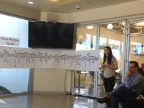
Mapping Experiences Rapidly – Free eBook
Mapping experiences is a broad set of activities that engage others. Though often focused on heavy, upfront research and hi-fidelity visualizations, these need not be the case. The benefits of mapping can be realized in a short period of time—about
Mapping Experiences Rapidly – Free eBook
Mapping experiences is a broad set of activities that engage others. Though often focused on heavy, upfront research and hi-fidelity visualizations, these need not be the case. The benefits of mapping can be realized in a short period of time—about
Combining Mental Model Diagrams and Jobs To Be Done
Jobs to be done and mapping experiences go hand in hand. This is a case study of combining mental model diagrams with jobs to be done.
Combining Mental Model Diagrams and Jobs To Be Done
Jobs to be done and mapping experiences go hand in hand. This is a case study of combining mental model diagrams with jobs to be done.

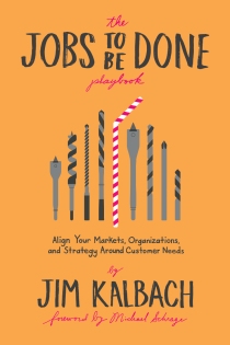
A Practical Model for Jobs To Be Done (JTBD)
“People don’t want a quarter-inch drill, they want a quarter-inch hole” – Theodore Levitt The concept of jobs to be done provides a lens through which to understand value creation. The approach looks at customer motivations in business settings. The
A Practical Model for Jobs To Be Done (JTBD)
“People don’t want a quarter-inch drill, they want a quarter-inch hole” – Theodore Levitt The concept of jobs to be done provides a lens through which to understand value creation. The approach looks at customer motivations in business settings. The

4 Common Misconceptions about Jobs To Be Done (JTBDs)
The concept of jobs to be done provides a lens through which we can understand value creation. The term was made popular by business leader Clayton Christensen in The Innovator’s Solution, the follow-up to his landmark book The Innovator’s Dilemma. It’s a straightforward principle: people

Find Opportunities with Jobs To Be Done
The famous Harvard professor Theodore Levitt once said: “People don’t want a quarter inch drill, they want a quarter inch hole.” The drill is a means to an end; the goal is making a hole. (Some have even gone further and
Find Opportunities with Jobs To Be Done
The famous Harvard professor Theodore Levitt once said: “People don’t want a quarter inch drill, they want a quarter inch hole.” The drill is a means to an end; the goal is making a hole. (Some have even gone further and

Mapping Experiences: Five Key Questions to Get Started
Kicking off a mapping project and don’t know where to begin? You’re not alone. I’m often asked how to get started. Here’s the problem: “experience” defies precise definition. It’s a broad and fuzzy concept. You need to first untangle it
Mapping Experiences: Five Key Questions to Get Started
Kicking off a mapping project and don’t know where to begin? You’re not alone. I’m often asked how to get started. Here’s the problem: “experience” defies precise definition. It’s a broad and fuzzy concept. You need to first untangle it
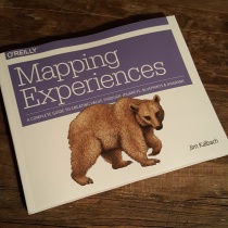
Mapping Experiences – Book FAQ
Finally! After a long wait and many delays I’m happy to announce my second book has been published: Mapping Experiences. Here are some common questions I get about the book: 1. Why did you choose a bear for the cover? As far
Mapping Experiences – Book FAQ
Finally! After a long wait and many delays I’m happy to announce my second book has been published: Mapping Experiences. Here are some common questions I get about the book: 1. Why did you choose a bear for the cover? As far
